Sunday 30 October 2011

Thoughts and Ideas

After my recent research, I have come to change my mind as to how I want to present my newspaper.

Like The Guardian and The Independent; newspapers of the 21st century cannot be broadsheet size. This is backed up by the fact that when these two newspapers moved to the compact/tabloid size, their sales began to increase. This is a good example of how I can use real media texts and their ideas in order to create my own product effectively. As Bentley said, the making of the new is nothing more than the remodelling of the old, meaning it is important to use existing products to meet the conventions and needs of a target audience.
Because of this, I will also use the compact/tabloid size, which is 380mm x 289mm. Despite being the same size as a tabloid newspaper, I will be reporting and laying out my paper in a broadsheet manner, with serious stories and lexical choices. This is to follow the conventions of regional newspapers I have observed while theoretically catering for age groups across the board. Older people, who are a prominent audience of local newspapers, will be attracted to the conventional broadsheet style news coverage with the luxury of not having to carry around a giant newspaper, especially in a world where everything is now so compact, a la iPods, flat screen TVs and game consoles. This is the area I believe will attract more young people, who want to keep up with a comprehensive coverage of local news, while not looking un-cool or out of place reading what many see as an outmoded form of news with the expansion of the internet. Because of this and my survey results alike, I will be fully integrating technology into my newspaper, giving it a youthful slant but at the same time not alienating older generations who do not ‘tweet’ or use Facebook.

I will keep the same formal layout as broadsheet newspapers I have observed like the Cornish Guardian, again to please traditional consumers, and even pry CG readers away by moving into the 21st century in terms of evolving local news with technology and bringing in more interest from wider age groups who have expressed an interest in local news in my survey.

Tuesday 25 October 2011

Analysis of Existing Media Texts

Before I create my own newspaper, I need to look at existing newspapers in order to find conventions to follow. Following conventions is a vital part of production, as to not alienate expecting audiences, especially in a society where everybody gets exactly what they expect and want.


Thursday 20 October 2011

Audience Profiling

Audience Profiling
Audiences can be grouped into certain groups, based on variables in order to better aim a product at them,
  • Gender
  • Age
  • Demographic, eg. where they live
  • Profiling; which is used to identify types of consumers

Insight Social Value Groups
These groups, as suggested by the National Readership Survey (NRS), are different types of people in relation to their social value group. It shows that different people have different characteristics, and products can be aimed at them by producers of media texts to give the audience a more personalised experience. Identifying these characteristics and meeting them in a way that appeals to these social groups is an important part in the planning and production of any media text, and this will not end at my newspaper.

In terms of newspapers in general, broadsheet readers are seen to be stereotypically in the traditionalist category, being averse to risk and guided by traditional behaviours, which coincides with stereotypes about broadsheet newspapers; apprehensive to change in fear of  losing a dedicated traditionalist audience.

If I were to go ahead with my plans to create a compact newspaper, I should aim my product at 'innovators,' who seek new things and new targets, as well as 'strivers,' who like to hold onto traditional values, but show importance in image and status. This is because people seeing an audience reading my newspaper will think they were interested in local affairs taken into a new perspective by a 'swanky' new newspaper, as drummed home by any advertising I would supposedly do, including the poster I need to create.

Tuesday 18 October 2011

News Update - Hillsborough Tragedy Debate

The Hillsborough football tragedy was finally debated in parliament last night, after 22 years of trauma from the families of the 96 fans killed in a fatal crush in the Semi Final of the FA cup at the Sheffield Wednesday ground in 1989.

Following the event, The Sun falsely reported lies on their front page to boost their sales. The front page was titled 'The Truth' and is known as the one of the most infamous stories in terms of inaccuracy to date.
The article, edited by Kelvin Mackenzie, stated that some fans picked the pockets of victims, urinated on 'brave' cops, and beat up other police members. All of these accusations have since been found to be untrue, though in 2005, Mackenzie said that he was 'not sorry' for printing the article, because he was adamant that it was the full truth.

In the debate yesterday, it was called for the newspapers sources to be revealed, so that there can be justice for the fans who were unfairly treated while they were grieving the deaths of their friends and families.
It was also strongly suggested that Mackenzie was 'never allowed to work for any media institution ever again,' by several MPs, though this does look unlikely - he's recently been employed by the Daily Mail.

Finally, the journalists involved will have to reveal where they gained the sources of their leading story from. Reporting false news like this is against the law, and especially in cases like this, certain methods of tabloid reporting in my view should be looked into. Moreover, I will take this into consideration in my own work - any stories I gather will have to be correct in terms of content, and quoting people correctly. It is important to learn from real media texts, both new and old, to look at the ways of reporting that work, and those that don't work. One thing we can take from any newspaper is that they are always trying to sell themselves to the audience, and a big scoop such as the aforementioned will help the cause while the paper is sat on a rack with its competition.

Saturday 15 October 2011

Front Page Conventions

Newspaper front pages have several functions, including attracting readers, giving the main news, showing what smaller stories the newspaper offers, and giving the paper an identity and personality through the colours and layout it uses. In general, newspapers will present themselves with a big headline on their front page.The headline will refer to he biggest story since the last issue, and this is often determined by public interest in terms of the target audience for the newspaper. For example, tabloid newspapers will traditionally have their main story as some celebrity gossip or scandal, usomg puns in the headline, whereas more broadsheet newspapers like to focus on (serious) political and economic happenings. The cover is the one chance to sell the product, so it needs to appeal to its target audience.

The ever colourful and scandalous tabloid
newspaper

This broadsheet newspaper is laid out in a much
more serious manner, with a powerful picture to sell the paper,
and lots of text.
The front page of a magazine can often determine peoples' opinions and expectations of the newspaper, and from this, stereotypes can be drawn about that newspaper. Just look at the picture of The Star above. Its price is written in the biggest font on the page, perhaps connoting that readers of the paper are particularly concerned about how much money they're spending, and even their decision to buy the newspaper hinges on how much it costs.
I feel, from looking at the above, that broadsheet newspapers' front pages seem to only document what is in that issue of the daily newspaper, whereas the tabloid front covers are almost an advertisement from the paper, perhaps assuming that their readers are not as dedicated; indicative of the stereotypical audiences of broadsheet and tabloid newspapers, business based people and young people respectively.


Local newspapers traditionally take the route of a more broadsheet style, particularly because of the lack of both interest and news within the entertainment industry of small regions, and more the will of close knit communities wanting to know just what is happening around them, as I found in my survey.

The Cornish Guardian, a good example of a local newspaper, shows that there are advertisements on the front page to keep the newspaper fairly cheap for readers, as well as a main story which is in the public interest, in this case, power and energy, as well as a side story which appears to be about education. Education is a big part of local newspapers, as opposed to national newspapers, as local schools and pupils have their chance to get their face in a newspaper.

Monday 10 October 2011

Masthead conventions

The masthead of a newspaper will be, along with the leading picture, the first thing somebody looks for when they see a newspaper on the shelves. It is used to identify the newspaper, and it gives the audience an idea of the identity and values that will be inside the paper.

Tabloids
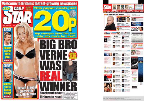
The logo within the masthead is integral in terms of how the newspaper is viewed by the public. Red-top tabloids are easily identified on the shelves by their red logos with big white font within them.
 
Redtop tabloid logos follow conventions in that they always have a red background with white writing, sometimes bordered by black or with a shadow. These logos are iconic because of the striking nature of way they are presented. When sat on top of a paper, they set the tone for a colourful, glamourised newspaper. It could the argued that the red backgrounds connote a passion that the tabloids report with, and the white is almost the ironic (given the scandals) face of innocence glaring at you. The red of the backgrounds could also be seen to be linked with the party colours for Labour, strongly supported by The Sun, The News of the World and The Mirror.

The graphology itself of the logos is often similar, where the text is centralised and written in bold font, very clear to see. This could fit in with the target audience and stereotypes of the newspapers as a whole, where tabloids are somewhere that people can get 'dumbed down' news, easy to read and quick to scan through.

These values represent the needs and stereotypes from a low social grade in terms of target audience; perhaps the C-E working class grade, because of its dumbed down sensationalist nature.

When the word 'Daily' or 'The' comes before the name of the paper, it is written above the main name within the height of the capitalised first letter. This correlates with other Sunday tabloids such as the Sunday Mirror, however The People is an exception to this, where 'The' is written vertically up the 'P' but still follows the convention of the moved 'The'.

Bearing in mind my newspaper will certainly not be a red top, I should not use these mastheads as a style model for my own paper as I do not wish to find myself associated with the values and beliefs of the tabloid press.

The Daily Mail, despite not using red mastheads like the aforementioned, is also a tabloid newspaper. Originally printed as a broadsheet, its logo is written in the traditional newspaper masthead typeface, which is synonymous with more broadsheet productions such as The Telegraph, and its symbol and layout is almost reminiscent of that of the Times. The Mail uses this to draw in an audience lesser educated in the workings of the printed press, giving passers by the deceitful impression that it might be something like a broadsheet, full of important news as opposed to the usual stories the other tabloids publish. Despite its cunning disguise, The Mail is still just as much a tabloid as say, The Sun; even down to its use of colour throughout its front cover, giving it a magazine-loving audience friendly look. Aside from the colour and font differences, the Mail's masthead does not present the word 'Daily' above 'Mail' in small font.

While I will not be emulating the style of the Daily Mail, its logo could be something, as a regional newspaper, that I could recreate, depending on what I want to call my paper. 

Compact
The world of compact newspapers is interesting, with originally broadsheet style newspapers shrinking to make themselves more appealing, but avoiding being classed as a sensationalised tabloid newspaper.

With the switch from broadsheet to compact, several changes can occur and I will posted about this on another blog. Papers will definitely be apprehensive about changing their mastheads in fear of alienating an audience, however this is what the Independent did recently, almost in order to move the paper into the 21st century. Above you can see that the old, more traditional font has been replaced with a big bold red typeface that takes up more room and the whole of the top of the front page. It is almost reminiscent of the typical tabloid design, but reversed. This could have connotations of it being the opposite to your typical tabloid, and the use of red really sets the tone for what is a colourful but similarly serious newspaper. The Times however, has kept its logo with the original crest. This gives a sense of a formal, seriousness to the paper which really runs throughout.

As far as the newspaper style is concerned, I think a compact newspaper is the way forward for me, my choice of masthead style may coincide with this. I am very interested in emulating the Independent's masthead style, as it is up to date and modern, and will appeal to a younger audience better than the plain typefaces as used in The Times' logo. It is also more sophisticated that tabloid mastheads, and would not bear unwanted connotations of a less serious tabloid.

Broadsheets
Broadsheet newspapers are typically more serious in terms of content, and this often wears off on the masthead style with layout and font, as in The Times. There are few broadsheets around in the present day, as papers switch to compact or berliner format to cope with a newer audience, however the lasting broadsheet papers have stuck to their guns in their content, size and mastheads.
The Telegraph's typeface is very traditional in its little flicks on the letters, its plain black colour, and the fact it hasn't really changed over the years. Similarly, its name 'Telegraph' has connotations of somebody receiving information via a telegraph or other old fashioned equipment, but I will discuss this in another blog post. The FT's masthead has a very plain font, and it does not seem likely that any advertising effort is made within the typeface or layout. This will be because you either buy the FT or you do not buy the FT; not many people will be in debate with themselves as to whether or not to purchase it. Potentially, its layout (boring and plain) may be representative of its subject matter to most people, or even the people who are regular readers!

These pitch much higher in terms of 'social rank' than the tabloids do, because of their traditionalist nature and largely black and white format within the masthead and throughout the newspaper. I would suggest that broadsheet newspapers pitch at around the A-B areas of social class, as they clealy address more pressing issues in society, while keeping in the more traditional 20th century format that has died out with the expansion of the internet and consice news.

While I will not be creating a broadsheet newspaper, my product will be firmly broadsheet content based, meaning it will hold similar features of the broadsheet newspaper we know and love. Because of this, I will look to simplistic traditional broadsheet mastheads for inspiration and layout when creating my own, as I want to meet the target audience of broadsheet newspapers who feel the need, as I do, to move on from big papers and condense the same content down to a compact newspaper, which leads me on to the Guardian.

Guardian
Like the Independent, the Guardian has previously been printed as a full broadsheet newspaper, however unlike the Independent, which switched to compact, the Guardian moved to the Berliner format (again, I will explain this on another post).
The Guardian's logo is written in two different colours, the first I have explored to do so in this way. The font and colour fit in with the nature of the paper, with it having a blue theme and a blue bar along the top.
Like the Independent, I would be interested creating my own masthead like that of the Guardian's, as it meets the target audience that I would be happy to aim my own product at, given the way it has kept a lot of its readers since it went to compact form, thus having a lot of readers who are broadsheet quality based. The people I will be targeting are in the middle-upper social grade boundries with a split readership between males and females and I will ned to reflect this when looking at story and language choice. In terms of age, I will need to cater for an audience who can recognise by a front page that the quality of news will be good, and at the same time bring in lower social grades, like students and even the older generation.

Friday 7 October 2011

Compact Newspapers/Berliner Format

As the name suggests, compact newspapers are small versions of bigger, generally broadsheet newspapers, and the name was coined by the Daily Mail in the '70s, who were predictably reluctant to be classed as tabloids. Newspapers such as the Independent and The Times, which were formally printed as broadsheets until they switched to compact newspapers, anticipated a change in the print market. Suddenly, with the rise of technology, it became easier to pick and choose stories for free from the internet, and the appeal of reading through a frankly massive 22" paper became less and less.

The Independent was the first paper to make the move to compact in 2005, as it was difficult for such a large paper to be read on transport, and in particular the London Underground and buses. The Times copied the move as The Independent's sales rose, and when broadsheet and compact versions went on sale, the smaller version generated more interest, and so the compact newspaper was truly born.

Compact newspapers are strictly not tabloid newspapers though, despite sharing the same size. One of the functions of a compact is to report broadsheet quality news.

In terms of my own newspaper, I think the compact paper is a very very good idea, because as mentioned it is not too large to read in public, yet contains a good amount of proper broadsheet journalism, not hindered by its size. For me, the positives definitely outweigh the costs of creating a smaller newspaper, and it is definitely an area I will contemplate when moving into my final preparations up to my practical work.

The Berliner format, which the Guardian is printed in, is just bigger than the compact/tabloid size, yet considerably smaller than a broadsheet newspaper. It is very popular throughout Europe and Asia, and it is another option I will explore.

Tuesday 4 October 2011

Market research findings.

I have written up my findings from my survey into a Prezi. I have drawn conclusions from what I found and it will be useful for my project.
You can view the Prezi below, and as usual you can click to make it full screen if the text is unreadable.