In what ways does your media text use, develop or challenge forms and conventions of real media products?
Friday, 4 May 2012
Evaluation 4
How did you use media technologies in the construction and research, planning and evaluation stages?
Wednesday, 25 April 2012
Monday, 23 April 2012
Finalised poster and potential application

Because I wanted to put my poster on a bus-shelter to advertise my newspaper, I decided to have a 5 minute Photoshop mess-about (as if I'm not busy enough) to see what it would look like in the real world, and I have to say, it does look the part. I am happy with my product.

Sunday, 22 April 2012


Friday, 20 April 2012

Friday, 30 March 2012


Poster - First draft
This is my first draft of my poster advertising my newspaper. I have chosen waves in the background to connote 'breaking' news, and they are synonymous with the Cornish landscape. In terms of the centrepiece, the newspaper - I think there is room for improvement. My peers and teachers have informed me that I will need to write actual articles instead of faux ones, and the advertisement on the page looks tacky. Other than this, I am pleased with it as a first draft.


Thursday, 29 March 2012
My Adverts
As I have already posted, local newspapers heavily rely on advertising, and because this is a common convention, I will need to conform to it in my own work. Going against my flat plans, I have decided to go with just the one advertisement on the front page, as to not annoy my target audience. This advert is an advert for a free sports section pull-out
 This advert, which is essentially a banner that runs along just underneath my masthead, is typical of your usual freebie advertisement. In essence, I needed something quick and easy to make, and this is what I came up with. Its colours and font choice alike connote a different 'side' to the newspaper, where the extra colour on the front page really jazzes it up. The gold font and ticket colour I used is appealing as gold is a desirable object, and the reader/potential reader will be more inclined to open the paper to find out the deal. The idea of 'golden tickets' could cause some excitement among people, particularly those who will naturally link it to Charlie and the Chocolate factory - which could be a good selling point for my newspaper.

Wednesday, 28 March 2012
Website categories
At the top of most newspaper websites, as I have observed, there are several categories in a horizontal strip on which you can click to get the news from that section. In the past, these have commonly been known to be listed down the left hand side of a newspaper, though it has become more fashionable to go with the horizontal look of late, and this is shown with prototypes of Microsoft's new platform 'Windows 8' being released, which revolves around a start menu fundamentally built around the horizontal idea. I will be including this in my own website to meet the conventions of those I have analysed previously.
First is always the 'news' section, which highlights the main stories of the day. This is almost a must in terms of newspaper websites, so I will need to conform to these conventions to please audiences. In terms of colour, while I am at present undecided about the shade of my tabs, I will be looking to follow the convention set by the websites I have analysed by making the news section red.
I also aim to make the tabs correspond with the colour chart/rainbow synchronisation, as it adds to the continuity of the page and is easy on the eye. This is what I observed the 'This is Cornwall' website does, and I liked it a lot.
Secondly, I will have a 'sport' section, which would supposedly bring up a page filled with sport related news. Though nobody voted for sports stories in my newspaper, I think it is imperative I include it because it is such a big part of society. Again, conventionally, the sport section is second or third in the bar, despite being always located at the end of the newspaper itself, where the back page effectively acts as a front page for sport.
Other subjects my study revealed young people were interested in include food, which I will be including in an 'eating out' section, aimed at tourists and people who want to go somewhere to eat. Similarly, politics was a popular topic, for which I will house a separate tab again, where I could write about increased petrol prices among other things. I would integrate national and Cornish politics for a politics page, as I would with the stories and I plan to do this for the newspaper in general.
Also popular were technology stories, which despite everybody's keenness for them, are fairly scarce, as I have discussed on a previous post. Conversely, I want to quote Twitter and Facebook within my articles to keep younger people in touch with my newspaper.
Finally, I have decided to go with Weather, as everybody seems to be raving about it all the time. It is also a key part of a local news website and keeping people in touch with it is vital to becoming successful.
Website analysis
Before creating a website, I must look at the conventions set by other newspapers' websites.
Sunday, 25 March 2012
Storyboard and video ideas
I have decided to do my moving image on my main pasty story, as it will generate the most interest from local people visiting my webpage. I have also taken inspiration from The Guardian video I looked at on the internet in terms of the opening and closing title scenes. I will start my video with black with my logo in white fading in, perhaps reminiscent of the Cornish flag, and this is how I will end it as well with each scene at around 3-5 seconds long. I plan to have two shots in my video with voiceover information, each of these being 10-15 seconds long. I want to have two different shots of Barnecutts in Bodmin, explaining how they were running a petition to be sent to London and how they were unavailable to comment on the matter. Here is my storyboard:


Chris Morris, Bodmin Football Academy Interview
I interviewed a member of PE staff and Football Academy at Bodmin College about sport relief:
"Sport Relief is a fantastic opportunity for ordinary people to contribute and make a difference to vulnerable people in the UK and some of the poorest people around the world. We can all join personalities from the sporting and entertainment world and between us can make a difference."
"Sport Relief is a fantastic opportunity for ordinary people to contribute and make a difference to vulnerable people in the UK and some of the poorest people around the world. We can all join personalities from the sporting and entertainment world and between us can make a difference."
Friday, 23 March 2012
Stories - Pasty
The story on the pasty tax is a story that everybody is talking about, both on a national and local scale, on the news and around college. Because of this, I felt it appropriate to run with it as a late inclusion as my main headline, as it has clearly captured the imagination of so many of late. For this story, I want to give an insight into why people are getting so annoyed and side with them, as to not appear to be on the side of the government. As well as this, I hope to get an interview with a pasty company worker or someone similar.
Update: I have written my article, and it is here:-
THE UNVAILING of this week’s budget by Chancellor George Osborne has been subject to widespread criticism by the South West after what appears to be a tax on pasties among what are deemed to be ‘hot take-away foods.’
The so-called ‘pasty tax,’ which will hit the pockets of pasty lovers throughout the country in the coming weeks, is an attempt by the government to tax unhealthy fast foods in an unprecedented move to place the 20% Value Added Tax, or VAT on hot food.
However, many see the Chancellor’s new tax as just another way of bailing out the fragile economy by taxing everyday people and with this, there is increased pressure on Mr. Osborne to shelve the rise in price which some would argue will see hot food sales crumble in the near future.
It’s not just pasties that will be taxed though; all foods that are hotter than the ambient temperature of the room they are sold in will be subject to VAT – and this has spurred uproar from the Labour party as well as Greggs and local bakers Barnecutts.
Petition
Barnecutts, who have bakeries in Bodmin, Wadebridge, Liskeard and St Austell, have created a petition against the proposed tax action, and it is available to sign at any of their outlets. Naturally, Barnecutts and Greggs are fearful of losing some of their biggest buyers; families, who are already struggling with the increasing cost of living.
Customers weren’t warm to the idea either; one man outside the shop was furious when The Cornish Insight broke the news to him:
“Well, all I’ll say is nobody voted this government in and since then, everyday families like mine have struggled to make ends meet with the fuel prices, inflation, and now this.”
The plans are not coming in for at least a few weeks, but you can still sign Barnecutt’s petition or write to your local MP.
-
As you will see, I failed to get an interview with Barnecutt's staff as they refused one, as did the staff at Costcutters. As time was running thin, I decided to interview a keen pasty eater outside Barnecutts on his opinions.
I also took some pictures for my main headline image. I wanted a photo of a half-eaten pasty on the front of my newspaper to lure people into it, as Cornish people are traditionally pasty-mad. The images are below.
 As I have said, I wanted a picture of a half-eaten pasty, so started taking different shots of one. The pasty though, which was admittedly very tasty, was not so photogenic, and I found that I needed to put it on the floor around a nice patch of grass to get a good effect. I like the image of the pasty on the grass because we are looking down on the pasty in an almost controlling way, where we are either embracing to eat it or looking at it, which I think could connote me giving readers an insight into the story. The same could be said about the other pictures of the inside of the pasty, though this did not give the effect I wanted for the leading story at all.

Update: I have written my article, and it is here:-
THE UNVAILING of this week’s budget by Chancellor George Osborne has been subject to widespread criticism by the South West after what appears to be a tax on pasties among what are deemed to be ‘hot take-away foods.’
The so-called ‘pasty tax,’ which will hit the pockets of pasty lovers throughout the country in the coming weeks, is an attempt by the government to tax unhealthy fast foods in an unprecedented move to place the 20% Value Added Tax, or VAT on hot food.
However, many see the Chancellor’s new tax as just another way of bailing out the fragile economy by taxing everyday people and with this, there is increased pressure on Mr. Osborne to shelve the rise in price which some would argue will see hot food sales crumble in the near future.
It’s not just pasties that will be taxed though; all foods that are hotter than the ambient temperature of the room they are sold in will be subject to VAT – and this has spurred uproar from the Labour party as well as Greggs and local bakers Barnecutts.
Petition
Barnecutts, who have bakeries in Bodmin, Wadebridge, Liskeard and St Austell, have created a petition against the proposed tax action, and it is available to sign at any of their outlets. Naturally, Barnecutts and Greggs are fearful of losing some of their biggest buyers; families, who are already struggling with the increasing cost of living.
Customers weren’t warm to the idea either; one man outside the shop was furious when The Cornish Insight broke the news to him:
“Well, all I’ll say is nobody voted this government in and since then, everyday families like mine have struggled to make ends meet with the fuel prices, inflation, and now this.”
The plans are not coming in for at least a few weeks, but you can still sign Barnecutt’s petition or write to your local MP.
-
As you will see, I failed to get an interview with Barnecutt's staff as they refused one, as did the staff at Costcutters. As time was running thin, I decided to interview a keen pasty eater outside Barnecutts on his opinions.
I also took some pictures for my main headline image. I wanted a photo of a half-eaten pasty on the front of my newspaper to lure people into it, as Cornish people are traditionally pasty-mad. The images are below.


Sunday, 11 March 2012
Petrol price photoshoot
Here are some images I took of Bodmin Morrisons to include in my newspaper for my story on petrol price hikes.


 Overall, I think this is the best image to use because it does not have any obstructions (like car mirrors or trees) in the way of the image. It will fit nicely next to my article, and gives readers a visual image of the story; something that will hopefully increase both the satisfaction of my audience and the verisimilitude of my production, as most stories on the first three pages of a newspaper will have an accompanying image.
If I have learnt anything from my experience taking these pictures, I have seen that the paparazzi and press photographers have a difficult job when it comes to photography and taking images for the editor. Several pictures will need to be taken, as some, it is guaranteed, will turn out to be blurred or not as you expect them to be. This was a good experience for me and I have learnt a few things about taking press images.
Wednesday, 7 March 2012
Progress - Poster
As I have flat planned, my poster will be a simplistic design outlining the launch of my newspaper. In the middle I want to house a picture of an edited version of my front cover which shows the headline as 'new newspaper on sale' or something along those lines. This is my progress in some screenshots:

 I needed to create a version of my poster suitable for going onto my poster, so I took my existing front page and edited the headlines to give a viewer a sense of the launch of this newspaper being big news, meaning they will be more likely to buy it.


I put my ideas onto a background of the Cornish flag, as when I did the same thing with a white background, my peers and teachers deemed it to be boring and uninteresting, despite meeting the conventions set by The Sun and The Guardian's posters. The Cornish flag, linking in with the uses and gratifications theory about involving the audience, to me was a good idea. However, it was clear that the font and the logo were not done justice by this background.

Instead of the Cornish flag background, I dug up an old photo I took at the sea in on the Cornish coast, which I felt both represented the region well, as well as keeping the interest of people passing by the poster. It also suited my 'breaking news' slogan, as you could argue the breaking of the waves connotes my newspaper breaking the news.
Monday, 5 March 2012
Website video analysis
On my website, I will need to include a video.
I have looked at this Guardian online video for inspiration as to how to present my video in order to both draw inspiration from it and observe the conventions it sets.
The title scene at the beginning shows that the video is from The Guardian, something that is a convention in videos like this. In my own video I will meet this convention. The video itself uses a voiceover, meaning all the information that would be displayed in an article could be conveyed through speech to the setting of a moving image, putting the users of the website right into the story.
In my own website, I hope to meet the conventions set here by The Guardian's videos in terms of the title sequence that starts and finishes the video, though I will storyboard and plan my video in another post.
Friday, 2 March 2012
Story - Sport Relief
For my Sport Relief story, I want to talk about the way people will be raising money, and what they think of it. I also want to integrate interviews and images to beef up my story a bit. Because of this, I will interview a member of the PE department at college, who will give me an insight into what he thinks Sport Relief is all about. I intend on giving information about our local Sport Relief mile as well.
Update: Here is my finished article:-
BBC SPORT RELIEF is this weekend, and hundreds of thousands will be doing their bit by running the Sport Relief Mile for charity across the country.
Sunday sees hundreds of venues across Great Britain playing host to enthusiastic runners of all ages and Bodmin will be one of those places. Starting from Bodmin Rugby Club, participants can choose whether to complete one, three or six miles.

 The images have not come out with the best quality I had hoped for, however, as I have mentioned, my flat plan meant I only needed a head and shoulders shot of him, which would be relatively small and in the corner of my page.
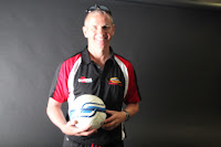
 I chose this photo to use, because he was looking face on at the camera, which I thought gave the best effect. The lighting, which is admittedly very bright, does not matter much in a world of Photoshop and image manipulation, so I found it no problem to edit this as I wanted it.
Update: Here is my finished article:-
BBC SPORT RELIEF is this weekend, and hundreds of thousands will be doing their bit by running the Sport Relief Mile for charity across the country.
Sunday sees hundreds of venues across Great Britain playing host to enthusiastic runners of all ages and Bodmin will be one of those places. Starting from Bodmin Rugby Club, participants can choose whether to complete one, three or six miles.
The run, coined the ‘Bodmin Beasts Mile’ in honour of our mythical friend, is being organised by Sainsbury’s in what will surely be a national event to
remember, raising money for those who are less advantaged.
Half of the money raised by Sport Relief will be spent in the UK, and half in other countries around the globe.
Also, Bodmin College will be fundraising for the cause by dressing up in sport related attire, selling cakes and doing the Mile on their grounds.
Bodmin College football academy manager Chris Morris said “Sport Relief is a fantastic opportunity for ordinary people to contribute and make a difference to vilnerable people in the UK and some of the poorest people around the world.
“We can all join personalities from the sporting and entertainment worlds and between us we can make a difference.”
-
I have also taken a selection of pictures to meet my flat plan, on which I have included a small image on the top of page three of the Mr. Morris. They are below:


Tuesday, 21 February 2012
More stories - Boardmasters, Petrol, Police
Boardmasters
With my article, I will outline who is going to be performing at the festival this year, as well as history from other years and more information people might like to know, such as the website and Twitter accounts for the festival.
Update: Full article - Sheeran To Headline Boardmasters
The eagerly anticipated line-up for this year’s annual Boardmasters festival in Newquay has been announced this month, with the notable inclusions of successful young artists Ed Sheeran and ‘Bonkers’ rap artist Dizzee Rascal.
Sheeran, who earlier this year won two BRIT awards including ‘Best British Male Solo Artist’ and has hits with “A-Team” and “You Need Me, I Don’t Need You,” is seen as one of the biggest prospects in the British music industry.
In previous years, the ‘surf & skate’ festival, which is mainly hosted on Fistral Beach and Watergate Bay, has attracted acts such as Fat Boy Slim, Plan B, The Streets and Paolo Nutini; capturing the imagination of music lovers from around the South West, and this year will be no different. Other acts confirmed for 2012 include The Ting Tings and Maverick Sabre as well as sets from Radio 1’s Zane Lowe and dubstep artist DJ Fresh.
Fans hoping to make the short trip are being warned that tickets are expected to sell quickly for this year’s event, which is to be held from August 8th-14th with music on Friday 10th and Saturday 11th. For more information, visit the Boardmasters website www.boardmasters.co.uk or follow @BoardmastersRBM.
-
I happened to attend last year's event, in which I took some pictures which I have recycled for my newspaper. They are here:
 I like the lighting on this image, as well as the angle it is taken from. However, I wanted to use an 'action' image, where it almost advertises the event. In this case, people stood around waiting is not indicative of having that much of a good time.

 I almost used this image for my article because of the lights coming from the stage and the movement of the crowd in front of the camera, however the night-time atmosphere gave a negative feel to my page, with the dark colours not fitting in well with the rest of my double page spread.
 This is the image I eventually used. I like it, because it has the angle and lighting I spoke of from the first image, yet captures the festival in full swing, which was what I wanted.

Petrol Prices
As a fairly new driver myself, I wanted to cover a story on the increase in petrol prices, which isn't difficult to find as they seem to be going up every week. I feel that it meets the needs of my target audience because in my survey people voted for politics-based stories. It is something that affects everyone in tough economic times.
Update: Full Article:-
Pasty lovers aren’t the only people with reason to be dismayed at the release of this week’s budget by Chancellor George Osborne, as fuel prices continue to increase, becoming the highest rates ever for fuel in the UK. Annoyed motorists took to The Cornish Insight’s brand new and increasingly popular Facebook page to express their disgust at the latest tax on drivers. One lady explained how she felt;
“I’ve voted conservative all my live, but I can stand up and admit they’re ruining our country at the moment. Ordinary people just can’t hold down a living with all these cuts and taxes. It needs to stop!”
And this seems to be the general feeling among the public; as petrol has become a necessity in recent times, albeit an expensive necessity.
Riots
For BBC News Day, a youth official for the South West was asked by Bodmin College students why he thought the August riots did not reach Cornwall. He said that, amongst other things, our 'white background' helped us through the anarchy in the rest of the country. I think that this will be a good story to cover, as it is extremely interesting for all readers. I have to be careful that it is not too sensationalised, in fear of either misquoting him or becoming a tabloid style newspaper. I wanted to use this as one of the smaller articles in the end, as it is not a particularly big story, but it would still feature on my first three pages. Because of this, I have only written a paragraph towards it
Update: - article
With my article, I will outline who is going to be performing at the festival this year, as well as history from other years and more information people might like to know, such as the website and Twitter accounts for the festival.
Update: Full article - Sheeran To Headline Boardmasters
The eagerly anticipated line-up for this year’s annual Boardmasters festival in Newquay has been announced this month, with the notable inclusions of successful young artists Ed Sheeran and ‘Bonkers’ rap artist Dizzee Rascal.
Sheeran, who earlier this year won two BRIT awards including ‘Best British Male Solo Artist’ and has hits with “A-Team” and “You Need Me, I Don’t Need You,” is seen as one of the biggest prospects in the British music industry.
In previous years, the ‘surf & skate’ festival, which is mainly hosted on Fistral Beach and Watergate Bay, has attracted acts such as Fat Boy Slim, Plan B, The Streets and Paolo Nutini; capturing the imagination of music lovers from around the South West, and this year will be no different. Other acts confirmed for 2012 include The Ting Tings and Maverick Sabre as well as sets from Radio 1’s Zane Lowe and dubstep artist DJ Fresh.
Fans hoping to make the short trip are being warned that tickets are expected to sell quickly for this year’s event, which is to be held from August 8th-14th with music on Friday 10th and Saturday 11th. For more information, visit the Boardmasters website www.boardmasters.co.uk or follow @BoardmastersRBM.
-
I happened to attend last year's event, in which I took some pictures which I have recycled for my newspaper. They are here:


Petrol Prices
As a fairly new driver myself, I wanted to cover a story on the increase in petrol prices, which isn't difficult to find as they seem to be going up every week. I feel that it meets the needs of my target audience because in my survey people voted for politics-based stories. It is something that affects everyone in tough economic times.
Update: Full Article:-
Pasty lovers aren’t the only people with reason to be dismayed at the release of this week’s budget by Chancellor George Osborne, as fuel prices continue to increase, becoming the highest rates ever for fuel in the UK. Annoyed motorists took to The Cornish Insight’s brand new and increasingly popular Facebook page to express their disgust at the latest tax on drivers. One lady explained how she felt;
“I’ve voted conservative all my live, but I can stand up and admit they’re ruining our country at the moment. Ordinary people just can’t hold down a living with all these cuts and taxes. It needs to stop!”
And this seems to be the general feeling among the public; as petrol has become a necessity in recent times, albeit an expensive necessity.
Riots
For BBC News Day, a youth official for the South West was asked by Bodmin College students why he thought the August riots did not reach Cornwall. He said that, amongst other things, our 'white background' helped us through the anarchy in the rest of the country. I think that this will be a good story to cover, as it is extremely interesting for all readers. I have to be careful that it is not too sensationalised, in fear of either misquoting him or becoming a tabloid style newspaper. I wanted to use this as one of the smaller articles in the end, as it is not a particularly big story, but it would still feature on my first three pages. Because of this, I have only written a paragraph towards it
Update: - article
August’s Riots Didn’t Reach Cornwall Due To Lack of “Ethnic Diversity”
The anarchy and lawlessness which spread across the major cities of the country last year has been met with widespread coverage from the press, as people continue to search for answers as to why and how the chaos erupted. Cities like London, Manchester and Liverpool were all heavily affected by the riots, however the South West remained relatively impervious to the riots, which...
Wednesday, 15 February 2012
Progress - Website
My website is looking neat at the moment, especially given the fact this is the first time I have properly used iWeb for making a webpage. I have copied over from InDesign my logo to add continuity to my productions. I have also been working on creating tabs at the top of the page, following the conventions of the websites I have observed.
 Here I was just playing with a blank iWeb page, trying to make sense of it. After some issues with saving and one or two things disappearing from my page, I began to structure my homepage in a way that met my initial flat plans.
 Having imported my masthead and date, my webpage was starting to take shape. I used the line tool to separate off my masthead from the tabs that I chose beforehand. At this stage, while my website was looking good, it was looking fairly plain. I needed some colour to it.

 Using the blog function on iWeb, I was able to create story pages for my articles which would then link to my homepage. You will be able to see that near the conventional search bar on the right I had tried to add in drop down boxes which would link users to different areas of each section, for example under sport would be football and rugby and under entertainment would come music and film. I found the html code from the internet, though the boxes I created, after strenuous work trying to edit the code, would not re-size, meaning I had odd shaped drop down boxes which was impractical.
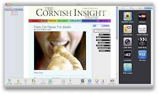 After realising the tabs on most news websites are colourful, I chose to do this myself. With this, I had to do a bit of manoeuvring with text and boxes, but I feel it was worth it as I liked the effect it gave. With this I started experimenting with other colours. Originally I wanted the background of my website to be white and simplistic, though I found this to look amateurish so gave it a neutral colour which in the end I was pleased with.


Friday, 10 February 2012
My stories
Boardmasters
I want to cover the announcement of the Boardmasters line-up in my newspaper because music stories scored highly in my survey when I asked people what they would like to see in my newspaper. Boardmasters is one of the biggest festivals in the South West, so would be a good story to cover in my newspaper. I will not need to be on the scene, so I will not need to spend money when researching the story, I need only internet facilities.
Fuel Prices
Another story I am to cover is that of increased fuel prices. Nearer the time of publication, there may be new hikes in fuel duty, but I want people's opinions on how the fuel prices are hitting pockets across the country; something that is currently frustrating me. Furthermore, people wanted to see political stories in my newspaper, as per my survey.
Sport stories
I want to incorporate local sport, and sport associated with the college into my newspaper, despite the fact my participants did not originally want to see sports stories in my newspaper. Sport is a big convention and selling point in newspapers, which is why I will be including it. I have also found that BBC Sport Relief will be coming up in March, so I will cover this.
I will keep my blog updated as I collect more stories in the run up to Easter.
Friday, 3 February 2012
Market research - posters
For one of my tasks, I need to create a poster. A good poster is one that attracts the attention of passers-by, but before I can make my poster, I need to know what it is that attracts those people to it.
 Firstly, I wanted to know whether or not posters actually had an impact on people, and question 1 sees that they do not appear to. This means that I will need to make my own poster imposing and thought-provoking, to make sure 4/6 people were not just 'walking straight past it' or 'not noticing' it. The answer for this could be colour, but similarly, some of the most striking images are simplistic, like The Beatles' The White Album.
 Secondly, I asked people what kind of outdoor advertising would catch people's eye, as I need to choose where to put my poster before I can make it, to get things like paper dimensions right. Unanimously, bus stop posters won over road side billboards, which doesn't surprise me, as people walking along a street will have more time to read a bus stop poster than they will if they are driving a car along a busy road and see a billboard for a newspaper. This suggests that I should use bus-stop posters, which fits in with my previous research, and now I know that it is what would catch people's eye the most.
 Finally, I asked what people think my poster should look like, and quite surprisingly the simplistic approach took a big lead against a more complex approach with more to digest. I think that in this climate of technology with instant information, people's attention span for something like a poster in the street will be minimal, so it is imperative I can grab their attention within the first few seconds of them laying their eyes upon it.
In all, my market research was extremely productive. I have learnt that I will need to make my poster attractive for an audience who seem to naturally block out posters in the street, as well the fact a bus-stop poster will be the most attractive, where people are stood aimlessly waiting for buses, looking around for something to stare at. I will also need to make my production simple but eye catching, much like those that I have already analysed.


In all, my market research was extremely productive. I have learnt that I will need to make my poster attractive for an audience who seem to naturally block out posters in the street, as well the fact a bus-stop poster will be the most attractive, where people are stood aimlessly waiting for buses, looking around for something to stare at. I will also need to make my production simple but eye catching, much like those that I have already analysed.
Thursday, 2 February 2012
Press Photography Research
As I will be taking photos throughout the course of my story-collecting stage, I will need to have some knowledge of press photography. Press photographers, like journalists, are essentially people who can work for large companies, media outlets or free-lance, who are hired to go out and take pictures on the scenes of big stories, openings of events, press conferences and stalking celebrities on their holidays to name but a few.
Unlike studio photographers, images are nearly always shot on location with a hand held digital camera. As well as this, the photographer will take a laptop with them, so images can quickly be uploaded to the internet ready to be published in a product by the editor, who has sent them there in the first place. The editor naturally decides which stories will make the newspaper, and the picture editor will make a decision as to the type of shots the photographer needs to go out and get, as well as how many images need to be used.
Typically, the general view of paparazzi photographers by the general public is one of an annoying, intrusive journalist constantly snapping pictures of famous people, eventually getting one shot in which they look miserable, and putting it on the front cover of OK magazine. Despite this, press photographers work to strict deadlines with great pressure on them to deliver good quality images that can be used in a publication. Often, they are expected to present up to five good quality images for each story they cover, so the picture editor has a good choice of image to use to fit around text and other images.
Often, press photographers can have niche specialities, such as celebrities, sport and the royal family, however on a smaller scale, like in my newspaper, photographers will be contracted to do all of these jobs.
With this knowledge in mind, when it comes to taking my own images with an SLR camera, I will take a variety of pictures, as when they are put onto a laptop and don't look very good, there is no going back to take more.
Sunday, 29 January 2012
Photography Research - Famous Press Images
There have been some iconic press photographs over the years, and these have both inspired and shaped views on stories and events since the conception of the still image. These images have been taken for the press, so I will need to know about them.
 Thich Quang Durc
 Phan Thj Kim Phuc
Also from the Vietnam War during the seemingly needless bombing of civilians in the country, this image shows the moment napalm was dropped on a small village. Children are photographed by Nick Ut burnt and in pain as they run away from their destroyed homes. This image has won the Pulitzer Prize, making it one of the most iconic press images to date.
 Raising The Flag on Iwo Jima
This iconic image shows the moment Joe Rosenthal captured American troops erecting a flag at Iwo Jima in Japan. This image is recognised worldwide for its legacy; the war memorial named after it in Arlington.
Despite being in black and white, the colour of the image still has an impact, where the darker blacks and greys create a dark, momentous feel to the image. The subject of the image; the people and flag connote team work, something that would have been a theme throughout WW2.
 Vulture Stalking a Child
Kevin Carter went to Sudan in the early '90s and took this iconic photo of a vulture sitting waiting for a poverty-stricken toddler to die. This image is iconic because it shows one small girl as a representation for poverty and a continent in fear. The photographer did scare the bird away from the toddler, and also won the Pulitzer Prize, however he committed suicide three months later having sold the photo to the New York Times and came under increased criticism for waiting 20 minutes for the bird to spread its wings for better effect.
These images, while on a bigger and more international scale than my project, are still useful and valuable resources in terms of the way I can use photography in my own work. I now know some of the basics in terms of making an iconic image; the black and white of some of the above, giving the impression it is from older times (and they are), and the action shot used in the Raising The Flag on Iwo Jima gives a sense of togethness, passion and national pride - something I could exploit my readers with in terms of emotion.

During the Vietnam War, there was a Buddhist uprising, who naturally disagreed with the violence going on around them. This monk decided to be a martyr to raise attention to their cause, took out a petrol can and smothered himself in gasoline. Malcolm Browne was there to immortalise the moment as the man's body began to burn and wither. A similar image to this won the 1963 World Press Photo of the Year, though this became the most famous version.

Also from the Vietnam War during the seemingly needless bombing of civilians in the country, this image shows the moment napalm was dropped on a small village. Children are photographed by Nick Ut burnt and in pain as they run away from their destroyed homes. This image has won the Pulitzer Prize, making it one of the most iconic press images to date.

This iconic image shows the moment Joe Rosenthal captured American troops erecting a flag at Iwo Jima in Japan. This image is recognised worldwide for its legacy; the war memorial named after it in Arlington.
Despite being in black and white, the colour of the image still has an impact, where the darker blacks and greys create a dark, momentous feel to the image. The subject of the image; the people and flag connote team work, something that would have been a theme throughout WW2.

Kevin Carter went to Sudan in the early '90s and took this iconic photo of a vulture sitting waiting for a poverty-stricken toddler to die. This image is iconic because it shows one small girl as a representation for poverty and a continent in fear. The photographer did scare the bird away from the toddler, and also won the Pulitzer Prize, however he committed suicide three months later having sold the photo to the New York Times and came under increased criticism for waiting 20 minutes for the bird to spread its wings for better effect.
These images, while on a bigger and more international scale than my project, are still useful and valuable resources in terms of the way I can use photography in my own work. I now know some of the basics in terms of making an iconic image; the black and white of some of the above, giving the impression it is from older times (and they are), and the action shot used in the Raising The Flag on Iwo Jima gives a sense of togethness, passion and national pride - something I could exploit my readers with in terms of emotion.
Subscribe to:
Comments (Atom)