Sunday 29 January 2012

Photography Research - Famous Press Images

There have been some iconic press photographs over the years, and these have both inspired and shaped views on stories and events since the conception of the still image. These images have been taken for the press, so I will need to know about them.

Thich Quang Durc

During the Vietnam War, there was a Buddhist uprising, who naturally disagreed with the violence going on around them. This monk decided to be a martyr to raise attention to their cause, took out a petrol can and smothered himself in gasoline. Malcolm Browne was there to immortalise the moment as the man's body began to burn and wither. A similar image to this won the 1963 World Press Photo of the Year, though this became the most famous version.
Phan Thj Kim Phuc

Also from the Vietnam War during the seemingly needless bombing of civilians in the country, this image shows the moment napalm was dropped on a small village. Children are photographed by Nick Ut burnt and in pain as they run away from their destroyed homes. This image has won the Pulitzer Prize, making it one of the most iconic press images to date.
 Raising The Flag on Iwo Jima

This iconic image shows the moment Joe Rosenthal captured American troops erecting a flag at Iwo Jima in Japan. This image is recognised worldwide for its legacy; the war memorial named after it in Arlington.

Despite being in black and white, the colour of the image still has an impact, where the darker blacks and greys create a dark, momentous feel to the image. The subject of the image; the people and flag connote team work, something that would have been a theme throughout WW2.
 Vulture Stalking a Child


Kevin Carter went to Sudan in the early '90s and took this iconic photo of a vulture sitting waiting for a poverty-stricken toddler to die. This image is iconic because it shows one small girl as a representation for poverty and a continent in fear. The photographer did scare the bird away from the toddler, and also won the Pulitzer Prize, however he committed suicide three months later having sold the photo to the New York Times and came under increased criticism for waiting 20 minutes for the bird to spread its wings for better effect.

These images, while on a bigger and more international scale than my project, are still useful and valuable resources in terms of the way I can use photography in my own work. I now know some of the basics in terms of making an iconic image; the black and white of some of the above, giving the impression it is from older times (and they are), and the action shot used in the Raising The Flag on Iwo Jima gives a sense of togethness, passion and national pride - something I could exploit my readers with in terms of emotion.

Friday 27 January 2012

Market Research - Websites

Before I create my website, as well as looking at existing websites, I need to get people's opinion on what is a good website. To do this, I have conducted a survey asking people what a good new website should be, and from this I can design my own website accordingly.

First, I asked how often my participants visited news websites.
As we can see, most of the people who completed my survey do visit newspaper websites, which puts them in a good space to answer my remaining questions. This means the results I accumulate will be valid and therefore reliable.

Next, I asked whether people prefer the idea of reading a news website was more appealing than the paper itself.
Six out of seven people voted for newspaper websites being more appealing than the newspapers themselves. This suggests that there is a big market for online news and perhaps signals a new era for journalism, where people are more inclined to go onto the internet for free to read news than to go into their local shop and purchase a copy of the corresponding newspaper, especially in these tough times. Similarly, the layout, speed and quality of online news is such that it is superior to its 2-dimensional sister, and this survey poll suggests this further.

I wanted to know to what extent should a local newspaper delve into the news using its website?
 Contrary to what I thought, five out of seven people thought a basic website would be adequate to local news, giving me hope that the newspaper could live on after all. With most of those surveyed being media students, one can assume they identified the problem of many getting their news online and not being loyal to their newspaper as per days gone by, and suggest to let people buy the newspaper itself. This may be a good idea; tease the reader with some information, but let the newspaper give a more extensive coverage of stories, thus raking in the money.

Finally, I wanted to get some ideas about the colour of my webpage.
Clearly, colours attract people, so I will not be going black and white for my website.


I am pleased with how my survey went, I now have a good idea for when it comes to flat-planning my website as to what colours to use, and for the depth for information I will put on my articles in comparison with my newspaper.

Wednesday 25 January 2012

Progress - Newspaper

 I am working on the layout of my newspaper, taking inspiration from my style models that I analysed. Some evidence for this is in some screenshots I have taken of my progress.
As you will see, I have made my advertisements and am just now creating a template for me to fit my stories in when I have collected and written them up.


I am happy with my progress thus far and will keep updating my blog as to what I am doing, however the next step for me is to start collecting stories properly and getting them into a state in which they can be put onto a newspaper.

Sunday 22 January 2012

Flat plans

It is important to flat plan before creating a final product so one knows how to go about creating it. Improvisation will rarely produce a quality piece of work, so being organised is everything.


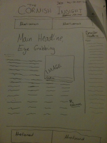
This is my plan for the front page of my newspaper. I have used layout ideas from other newspapers I have observed such as The Cornish Guardian and The Guardian. As per convention, I have put the masthead at the top, followed by some advertising space and then my main headline. In the advertising space, I will create my own adverts, which is likely to be eventful. On the right hand side there will be a column running in a vertical manner with a story there to read. My main story will have a striking image to grab people's attention and there can be more advertisements at the bottom, though I am currently undecided as to whether to put another story there. This can be a decision I make further down the line, as my flat plan will really only be the foundation stone of my front cover, with the layout and template ideas I can use.
This is my flat plan for my poster, which I want to have an adapted version of my front page on it. I want to do this to both connect with the person viewing the poster as well as make them aware of what my brand new newspaper looks like, so they will be familiar with it in the shop.
Like the style models I have observed, ie The Sun's poster, I wanted to create my poster on a white background, to give the viewer something to think about and create an impact. However, I am yet to decide whether this will work for my poster, as it could be seen as a bit boring in just black and white. This could be a choice I need to make while working on my poster.

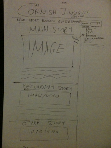
My website will be much like my newspaper in terms of colour and of course content, with my masthead and logo at the top. As well as this, I have planned for the date to be at the top of the page, as is conventional. Also conventional is the use of tabs, which I have added into my plan. I hope to have these in black and white to give it a professional feel. I will have each of my stories with a picture below these tabs, with my main story at the top and other stories leading on down from it. On the right hand side of my webpage, I want to have a bar where I can add widgets for things like the weather and traffic, something else one would expect to see on news websites.


 This is my flat plan for my double page spread. I have included my idea of the category boxes on page two for easy and quick access to the information, something I think is important in the expectancy culture we live in, especially amongst young people, one of my primary target audiences. I should not really deviate from this plan, though when put into InDesign, I may feel that there is too much space and will need to squeeze in another story. It is imperative for me that my product is as realistic as possible.

Friday 20 January 2012

Poster analysis

Before I create my poster, I need some inspiration from existing newspaper posters. I have chosen three rather different ones to analyse and observe conventions.

Guardian
This Guardian poster is a brilliant example of an advertising poster, as it is so simplistic yet colourful and informative and yet concise. The colours that are used match the colours that they use on their website; red, green, blue, pink, purple etc for the font colour in their tabs. This is indicative of The Guardian specialising in all areas of news, incorporating these into their website, which is also noted.
 The analogy of ‘opinion’ and ‘fact’ being similar entities but eventually going their own ways in a much clearer direction is naturally symptomatic of the newspaper knowing their facts from their opinions, but at the same time not disregarding opinions as rubbish, but valuing them, something The Guardian likes to pride itself on.
The way the two sets of words break away from each other brings to mind a shirt collar, or more so a zip with the guardian inside it. This may connote The Guardian unzipping information, or in particular opinions and facts.
 The short paragraph on the right hand side really backs this up; The Guardian is playing with the idea of separating opinions and facts, perhaps indicating it is not a tabloid newspaper, reports objectively but has a lot of time for opinion.
 I like the style of this poster because it is simplistic but does its job. It is also eye grabbing because of its colours and design. I would look to imitate something like this, and use its colours as inspiration for my own poster.
The SunThe Sun uses a unique idea for its poster, running with the idea of value for money. Its design, like that of The Guardian’s, is a very simplistic design, almost reminiscent of The Beatles’ White Album, albeit with an image.The receipt, which is a familiar object to most people, features all the bits of their newspaper they believe are selling points and value for 30p, though despite this, non-tabloid readers will look down the list and not be remotely interested in buying the newspaper. This suggests The Sun’s poster is being aimed at tabloid readers, almost trying to prise readers away from other tabloids like The Star and The Mirror, using their price which has traditionally always been lower. The red logo at the bottom almost brings memories of The Sun itself, where the logo stands out in a fairly white newspaper stand.The advert connotes that for what you get; the total is a meagre 30p, as explained at the bottom just in case anybody didn’t actually get it. I like this style, much like The Guardian’s, as again it is very simplistic, on a white background, using the colour of the red-top logo to capture passers-by’s attention. It almost says “need we say any more?” leaving the viewer with the impression the newspaper is perfect and they are missing out on a cheap, quality experience by not buying The Sun.The Sunday TimesThis poster, which was created when The Sunday Times got a makeover, is again astonishingly simple. Despite having a bit more content than the other two posters, this is imagination-capturingly brilliant.Regarding the cheesy ‘For all you are’ slogan, it entices and brings in interest by giving some indication of what ‘you’ are; something people often strive for years to find out. The use of the personal pronoun ‘you’ involves the reader and connects them with the newspaper without even reading it. Its use of colours to code each section of the newspaper is a running theme throughout newspapers, as was seen on The Guardian’s poster. The black background is an eye-catcher, especially as this poster was no doubt supposed to be a billboard poster, given its shape and size. Once again, this simplistic design is attractive in terms of ideas for my own poster, but I do prefer the other two posters to this one. This seems to suggest I should go with a portrait poster with a white background. I will take this into consideration along with some market research when creating my own poster.

Tuesday 17 January 2012

David Thomson Interview

Youth Intervention Officer for Devon, Cornwall and the Isles of Scilly on crime levels:

“I think the crime trends very often go up and down depending on what the situation is. If you’ve got a gang of youths that are going around then obviously certain kinds of crimes may rise or fall depending on the gang culture involved, and also crimes can actually change in a locality like Bodmin depending on what the dynamics are, so if you’ve got shops that are closing, and you’ve got a lot of deprivation, then obviously crimes go up. If you’ve got something that’s opening and rejuvenation obviously that creates a better feeling and crimes are going to go down."

On the most common crime:
"Without a doubt, obviously the most common crime is petty criminal damage, graffiti, mindless vandalism, kicking over bins, pulling off drainpipes, writing on walls with marker pens – simplistic offences that are easy to commit, and very difficult to actually investigate."

On August's riots:
"You’ve got a different culture down here, whereas up country you’ve got quite urban environments, and you’ve got quite densely populated areas and you’ve not got an awful lot of open area where people can get involved in stuff and do stuff. Down here we haven’t got a lot of large housing estates, the ones that we have got are fairly open-planned and therefore you haven’t got that dense environment where people can’t spread out, and I think if you’ve got a closed environment, you’re more likely to get problems because people are actually packed into a smaller area. Because we haven’t got that down here, that’s one factor that actually assists us. The other thing is the fact that the actual culture down here is different, because I think young people don’t necessarily see the problems that there are in an urban environment. We haven’t got a mix of cultures. We’ve mainly got predominantly a white background down here, whereas compared to major cities who have got a much more diverse culture, and I think that’s also part of it as well."


I can dissect this interview and search for stories. I am already particularly interested in the final point he makes about diverse cultures being responsible for riots.

Sunday 15 January 2012

Poster Post and Research

I need to create a poster to advertise my newspaper for one of my auxiliary tasks. Not being too familiar with many newspaper posters myself, I am beginning to look at them online, and will begin critically analysing them. This is important because, while I want to create something new and original, I need to be able to meet the conventions set by other newspapers.

Google Chrome 48 sheet billboard
In terms of where I want my poster to be viewed, I will be aiming for billboards throughout Cornwall. I have done some research and found that to publish a poster, one needs to rent a billboard through a company, choose a size and type, and pay the fee accordingly. Outdoor Advertising UK Ltd specialise in billboard advertising, and quote a price for a standard 48 sheet billboard, which is 609x304cm, as £165-200 per week. This is not a bad price, though if I wanted to create a portrait poster I would be restricted.

4 sheet advertising for Science magazine
Another type of poster advertising is bus-stop advertising, where posters are displayed through the transparent bus shelters littered across the country. The size for this is '4 sheet,' which is much smaller than a 48 sheet billboard, at 101x152cm. This is a much better size for me, though again I am restricted, this time to a portrait size poster. Painted Poster Media, who specialise in smaller advertising, such as in telephone boxes, buses and taxis, publish bus stop posters. To have my newspaper on bus-stops in Cornwall would be ideal, because I would be targeting an audience who clearly have time to read a concise local newspaper - commuters. Painted Poster Media quotes around £120 a week for bus-stop advertising.

I have concluded that bus-stop advertising in Cornwall would be the best place to put my poster, as I can meet a potential target audience as well as being a sensible size. With this, I have restricted myself to a portrait format poster, though I do not believe this to be a problem. I have also found that Painted Poster Media would be the place I would go to publish my poster, as they seem to have an expertise in British advertising.

Monday 9 January 2012

Stories

With the layout of my newspaper very much under way in Adobe InDesign, I am starting to gather stories and information that I can fill it with.

I want to cover the increase in petrol prices over the last years and months, and see how it is hitting every-day people. With this, I will comment on how people are using Facebook and Twitter to tell us about how they are struggling. For this, I intend to interview people.

With the benefit of studying at the local college, I will be able to give updates on the sport events taking place, and I can also talk about Bodmin Town FC, who play in the local league. I will also be able to cover BBC sport relief in March, as it will be a big interest point for people of all ages.

I will also be covering the announcement of the line-up for the Boardmasters festival, as music was something people wanted to see in my survey. Music is not just a strong story subject for young people, but for all ages.

As I collect more stories, I will begin writing them up. Despite my newspaper being a weekly publication, I will have some leeway when it comes to story dates as I will be producing the first issue.

Tuesday 3 January 2012

Advertising

An integral part of the print industry are the outside companies who choose to pay newspapers to advertise within their pages. With the cost of print not exactly at an all time low, and increased prices in living for the public meaning they have less money overall to spend on luxuries like a newspaper, especially when there are free alternatives, newspapers strive to get their prices down as far as possible. To subside themselves, valuable space is given up inside and often on the front page to give advertisers a chance to show themselves off, often for a hefty price which correlates with the size and placement of the advert.
Advertisements can be small or take up a whole page; they can be tucked away inside the newspaper or they can be displayed the front page in all their glory. The positioning of the advertisement can often be determined by the advertising companies, who will look to target a relevant audience by pitching at readers who share the common interests with the advertisement. For example, a company advertising new trainers will put their advert within the sport pages of a paper.

Advertising costs vary from newspaper to newspaper, but naturally local newspaper advertising is significantly less than to put an advert in a national paper. For a quarter page ad in local newspaper the Cornish Guardian, the cost is £144.00 according to their website, and £288.00 for half a page, both not inclusive of tax, and an extra 25% for guaranteed position and 25% for colour. These optional extras could bulk prices up to over £400 for a half-page advert, which is comparatively cheap in terms of national adverts.

In terms of my own newspaper, I can advertise free give aways inside my paper on the front page, meaning I can both use room freely and help sell my product. I will also need to create some advertisements; and I plan to do one for Bodmin College, one for a subscription to my newspaper, and another for the a rock festival.
Similarly, I will be using a free pull-out give away to lure readers into my newspaper.