It is important to flat plan before creating a final product so one knows how to go about creating it. Improvisation will rarely produce a quality piece of work, so being organised is everything.
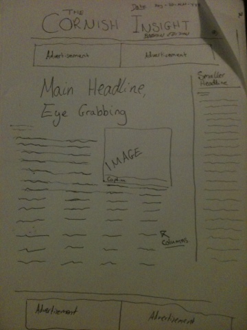 This is my plan for the front page of my newspaper. I have used layout ideas from other newspapers I have observed such as The Cornish Guardian and The Guardian. As per convention, I have put the masthead at the top, followed by some advertising space and then my main headline. In the advertising space, I will create my own adverts, which is likely to be eventful. On the right hand side there will be a column running in a vertical manner with a story there to read. My main story will have a striking image to grab people's attention and there can be more advertisements at the bottom, though I am currently undecided as to whether to put another story there. This can be a decision I make further down the line, as my flat plan will really only be the foundation stone of my front cover, with the layout and template ideas I can use.
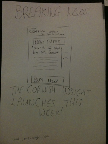
This is my flat plan for my poster, which I want to have an adapted version of my front page on it. I want to do this to both connect with the person viewing the poster as well as make them aware of what my brand new newspaper looks like, so they will be familiar with it in the shop.
Like the style models I have observed, ie The Sun's poster, I wanted to create my poster on a white background, to give the viewer something to think about and create an impact. However, I am yet to decide whether this will work for my poster, as it could be seen as a bit boring in just black and white. This could be a choice I need to make while working on my poster.
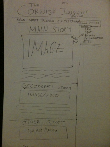 My website will be much like my newspaper in terms of colour and of course content, with my masthead and logo at the top. As well as this, I have planned for the date to be at the top of the page, as is conventional. Also conventional is the use of tabs, which I have added into my plan. I hope to have these in black and white to give it a professional feel. I will have each of my stories with a picture below these tabs, with my main story at the top and other stories leading on down from it. On the right hand side of my webpage, I want to have a bar where I can add widgets for things like the weather and traffic, something else one would expect to see on news websites.
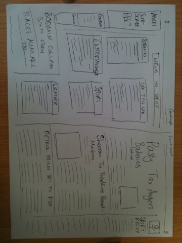 This is my flat plan for my double page spread. I have included my idea of the category boxes on page two for easy and quick access to the information, something I think is important in the expectancy culture we live in, especially amongst young people, one of my primary target audiences. I should not really deviate from this plan, though when put into InDesign, I may feel that there is too much space and will need to squeeze in another story. It is imperative for me that my product is as realistic as possible.
Proficient drafting.
ReplyDelete