My website is looking neat at the moment, especially given the fact this is the first time I have properly used iWeb for making a webpage. I have copied over from InDesign my logo to add continuity to my productions. I have also been working on creating tabs at the top of the page, following the conventions of the websites I have observed.
Here I was just playing with a blank iWeb page, trying to make sense of it. After some issues with saving and one or two things disappearing from my page, I began to structure my homepage in a way that met my initial flat plans.
Having imported my masthead and date, my webpage was starting to take shape. I used the line tool to separate off my masthead from the tabs that I chose beforehand. At this stage, while my website was looking good, it was looking fairly plain. I needed some colour to it.
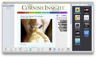
Using the blog function on iWeb, I was able to create story pages for my articles which would then link to my homepage. You will be able to see that near the conventional search bar on the right I had tried to add in drop down boxes which would link users to different areas of each section, for example under sport would be football and rugby and under entertainment would come music and film. I found the html code from the internet, though the boxes I created, after strenuous work trying to edit the code, would not re-size, meaning I had odd shaped drop down boxes which was impractical.
After realising the tabs on most news websites are colourful, I chose to do this myself. With this, I had to do a bit of manoeuvring with text and boxes, but I feel it was worth it as I liked the effect it gave. With this I started experimenting with other colours. Originally I wanted the background of my website to be white and simplistic, though I found this to look amateurish so gave it a neutral colour which in the end I was pleased with.


Good use of ICT, your skills are really developing.
ReplyDelete